
Back

E-Commerce
User Experience
Data-Driven Design
Responsive Design
Mobile
Visual Data Exploration
SERP
PDP
Compare
Related Products
User Interviews
Role
UX Designer
UX Research Methods
User interviews, competitive analysis, surveys, usability testing
Collaborators
Product Owner, UX Designers
Tools
Sketch, Zeplin, Abstract, Confluence
Thermofisher Scientific is a global biotechnology company that specializes in providing innovative tools, equipment, and services to researchers in various scientific fields, including an e-commerce platform for antibodies. Thermo Fisher aids scientists in their research and discoveries in areas like pharmaceuticals, diagnostics, and environmental science,
Boston
2006
Biotech, Pharma
$40 billion (2023)
100,000+
Challenge
The Antibodies E-commerce platform required an update to cater to the increasing sales and the growing number of scientists using the site. The existing shopping journey wasn't streamlined or intuitive for our users, leading to missed sales prospects. The goal was to enhance site navigation for our customers and open up avenues for increased sales.
Results
The redesigned app features a clean, clutter-free interface, making it easier for users to navigate and make purchases. I played a pivotal role in reimagining crucial aspects of the e-commerce journey, including the PDP, SERP, "Product Comparison", and "Related Products" experiences. These enhancements contributed to a 15% surge in additional sales, enabling customers to supplement their primary antibody product purchases with more items.

Antibodies E-Commerce Redesign
The antibodies website was where our customers begin their shopping experience. The goal of the site is inform our customers of the latest products and assist them in locating the antibody they are looking for as well gain a repeat customer. I was involved in the UX/UI updates for all sections of the site and the product price card design. Lets break it down by the each section of the experience.
Product Description Page (PDP)
With a recent surge in sales of our products, there was a pressing need to enhance our online shopping experience to match this demand. My role in this initiative was to streamline user flows, enabling customers to effortlessly find their desired items, and to refresh the user interface.

Customer Feedback
There were a lack of white papers or experimental results to help our customers make an informed decision on a purchase. We realized our customers want as much as information to review before making a purchase.
Design Decision
Based on the feedback received, we chose to position data and testing results above the fold in the PDP page, allowing users to immediately view the tangible outcomes from tests using that specific product.
Search Engine Results Page (SERP)
The goal was to improve the existing SERP user experience and optimize for a 1200px width
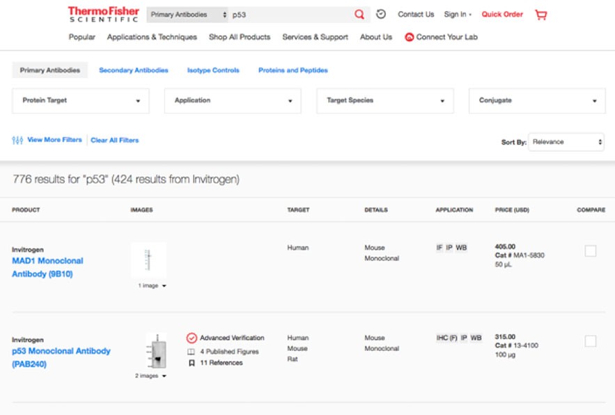
SERP Before

SERP After UX Enhancements
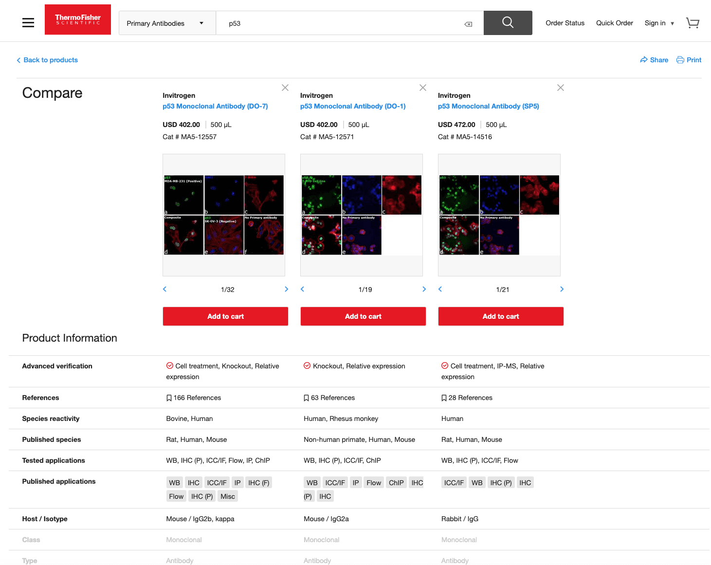
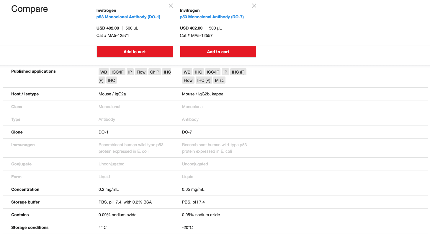
Comparison Modal Experience
UX enhancements were made in the existing Antibodies modal product comparison experience.
Customer Feedback
Customers indicated they were bouncing between multiple product pages to compare product specifications, which was time-consuming and frustrating.
Design Decision
Designed a "Comparison Modal" feature with a sticky header that keeps product names visible at all times, allowing users to easily select and view side-by-side comparisons of products directly from a single screen.
Old Compare Design
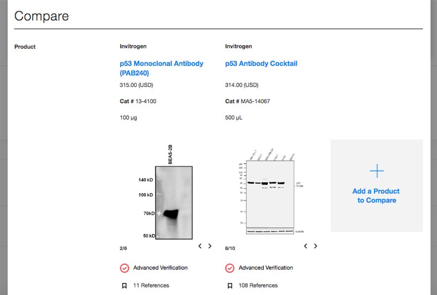
New Compare Design

Compare scroll down transition -> Sticky header
Related Products
I designed the Antibodies related products section in our product pages. This feature was an opportunity for our site to cross-sell products with the main product that they wish to purchase.
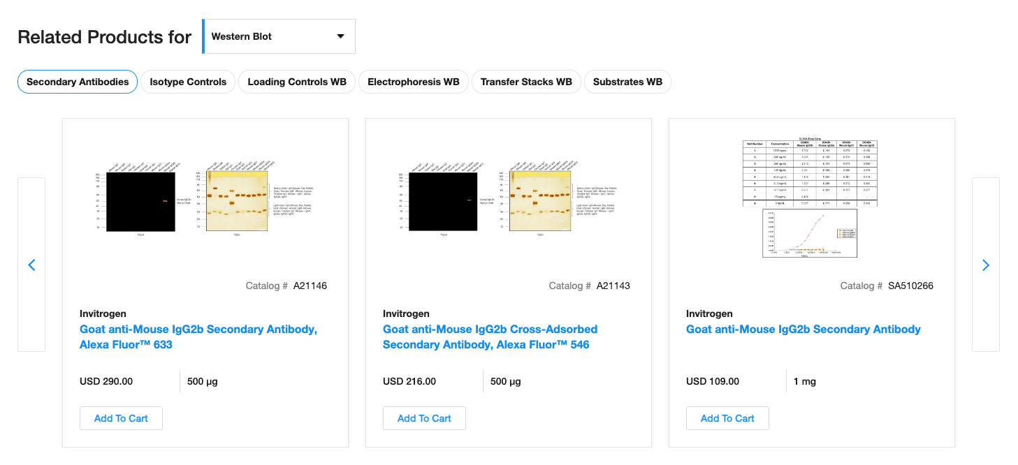
Related Products
Customer Feedback
Customers frequently mentioned the difficulty in finding associated products necessary for their experiments, leading to extended browsing times and abandoned shopping carts.
Design Decision
Introduced a "Related Products" section directly below the primary product details. This allows customers to quickly view and add complementary items to their cart, reducing the need for excessive navigation and enhancing their shopping experience. This decision resulted in increased purchases made through the related products section alone.

Related Products Card States

Usability Testing
Tests on new designs and UX enhancements were conducted at a testing facility in La Jolla, Ca. These tests were conducted in person which consisted of a moderator running the test, and the ux designers and key stakeholders involved in the project in attendance as observers.
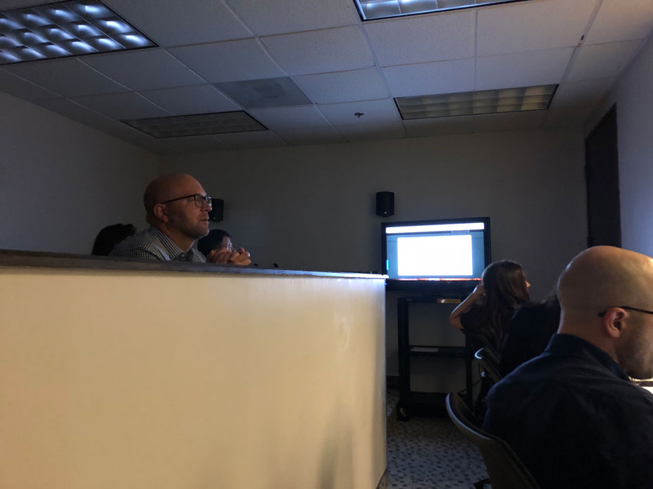
Observers in a room where they can see the test

The moderator and user are in another room but cannot see the observers